

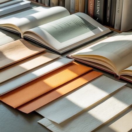

Many people assume that paper should simply be white. It is only when preparing a book, catalog or advertising materials that it turns out that there are many shades of white – and the paper color itself has a huge impact on the appearance of the entire project.
Interestingly, the paper does not have to be snow-white at all to look “better”. In many cases, a warmer or more natural shade gives a much more elegant effect and improves reading comfort.
Therefore, the color of the paper is one of those parameters that the printer always takes into account when producing.
Paper color vs. design perception
Paper affects how we perceive a print. Even with an identical design, the same graphic can look completely different on different papers.
Very white paper gives:
- greater contrast
- more “technical” look
- stronger colors
A warmer color, on the other hand, makes the design look more natural and calm.
That’s why it’s very common for books to use cream-colored paper rather than snow-white.
Paper color vs. reading comfort
One reason why paper is not always perfectly white is for visual comfort. Very bright paper reflects light strongly, which can be tiring when reading for long periods of time.
That’s why many publications are printed on papers with a slightly creamy tint, such as:
- Munken Print Cream
- Holmen Book Cream
- Amber Graphic
Such paper reduces contrast and makes the text more pleasing to the eye.
This is especially important for:
- novels
- educational books
- high volume publications
Paper color vs. paper type
The color of the paper also depends on the material itself and the manufacturing process. Uncoated paper usually has a more natural hue than coated paper.
For example:
- Nautilus SuperWhite has a cooler shade of white
- Munken Print Cream is noticeably warmer
- CircleOffset White looks more natural than classic chalkboard paper
That’s why the printer often shows paper samples before production begins.
Paper versus color printing
When it comes to color printing, the color of the paper is of great importance. Paper acts as a base for all inks.
On warmer paper:
- kolory wyglądają bardziej stonowanie
- czerń wydaje się mniej kontrastowa
- zdjęcia mają bardziej „miękki” charaktercolors look more subdued
- black appears less contrasty
- photos have a more “soft” character
In contrast, the very white color of the paper makes the colors appear more intense.
Therefore, for albums, catalogs or photo projects, it is very common to choose papers with high whiteness.
CIE Whiteness
In the printing industry, paper is often described by the CIE parameter. This is an indicator that determines the level of whiteness of the paper.
The higher the value:
- the more white the paper looks
- the cooler the shade may appear
However, this does not automatically mean better quality. In many projects, too much white looks simply unnatural.
Therefore, the color of the paper should always match the nature of the publication.
Paper color vs. premium effect
Interestingly, premium designs very often use papers that are not perfectly white at all. A slightly creamy or natural shade gives a more elegant and “noble” effect.
In practice, the paper very much affects the perception of the quality of the whole book.
That is why premium publications often use:
- Munken Lynx
- Munken Print Cream
- Nautilus SuperWhite
- CircleOffset White
Such materials make the book look more exclusive even without additional finishing.
Why does the printer ask about paper color
Customers often focus mainly on the grammage and type of binding, and treat the color of the paper as a detail. Meanwhile, it is this element that can completely change the character of the project.
That’s why the printer always asks:
- Whether the paper should be cool or warm
- Whether the design should look more premium or technical
- whether the priority is reading comfort or strong color contrast
Without this information, it is difficult to select the right material.
Summary
The paper color has a huge impact on the appearance and perception of the design. The paper should not always be perfectly white – in many cases a warmer or more natural shade gives a much better effect.
Therefore, the choice of paper should be considered as part of the graphic design, and not just a technical parameter. In practice, a properly selected color very often determines whether the publication looks ordinary or really professional.