


When one of our regular clients came up with the idea of updating their marketing materials in line with the latest trends, we knew we were in for an interesting challenge. His company wanted to launch a new line of promotional products that would reflect the freshest colour trends. Pantone had just announced the 2024 Colour of the Year. Peach Fuzz, a delicate peach shade that had stolen the hearts of many designers. Our client wanted this colour to be the main theme for their campaign. So we set to work to tell him everything we knew about Pantone and the 2024 Colour of the Year, and how best to use it in print. Here are four things you should know too!
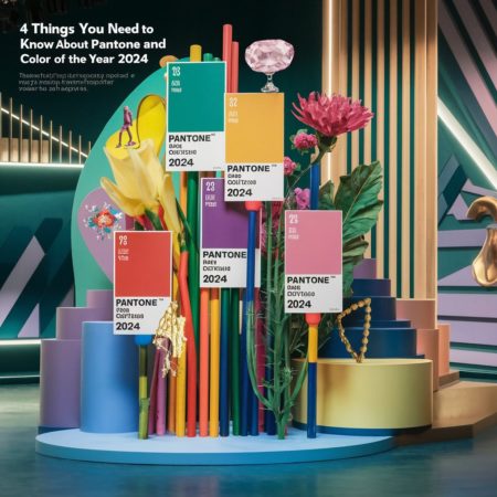
1. What is Pantone and why is their choice important?
Pantone is the global authority on colour. We can certainly use that term for the company that introduced the Pantone Matching System (PMS). It’s the kind of colour GPS that helps everyone, from designers to printers, to reproduce colours accurately. This is crucial in print, where colour consistency must be maintained at the highest level. Every year Pantone chooses a Colour of the Year. It has a huge impact on design, fashion, interiors and, of course, printing. Our client understood that efficiently incorporating Peach Fuzz into their campaign would help them stand out in the market and attract attention. For us, this meant one thing – making sure Peach Fuzz looked perfect on paper.
2. Colour of the Year 2024 – Peach Fuzz
Colour of the Year 2024 was 13-1023 Peach Fuzz. This peachy hue is extremely delicate, reminiscent of tinsel on fruit. Pantone says this colour brings calm and serenity. It is cosy, nostalgic and a little feminine, but modern enough that it would work equally well in ‘masculine’ designs. This colour was to become the heart of our client’s new product line, and we had to ensure that it was reproduced perfectly on all printed materials.
3. The importance of Pantone Colour of the Year in print
For a printer, being chosen Colour of the Year by Pantone is a big deal. When our client decided on Peach Fuzz, we had to ensure that the colour looked as beautiful on paper as it did on the computer screen. What did this entail? Let’s take a look:
- Keeping up with trends: Printers should adapt their services to the latest design trends, offering customers modern and attractive solutions.
- Colour consistency: Using the Pantone Matching System ensures that every colour printed is exactly the same. Regardless of where and when it is printed! This is crucial for maintaining a brand’s visual identity.
- Innovation in printing: Peach Fuzz has led us to experiment with new printing technologies to achieve the most accurate colour reproduction for different target products.
4. How to use Colour of the Year 2024 in print projects?
Certainly adapting Colour of the Year 2024 into print projects required attention to several key aspects. Working with our client, we focused on the following points:
- Accurate colour reproduction: The use of the Pantone Matching System was crucial to ensure that the Peach Fuzz on the print was without doubt identical to the real thing.
- Colour combinations: During the design process, we experimented with different colour combinations so that Peach Fuzz could stand out while creating a harmonious design.
- Materials and techniques: We chose the right materials and printing techniques to emphasise the uniqueness of Peach Fuzz. Using the right inks and the right papers added depth and intensity to the colour.
- Prototypes and testing: Before going into mass production, we made test prints to see how Peach Fuzz looked on different materials and in different lighting conditions. This allowed us to guarantee the most important thing: highest quality of the final product.
This is how Pantone and their choice for Colour of the Year 2024, Peach Fuzz, became more than just a colour guide. It became an inspiration that, thanks to its efficient response to trends combined with our printing expertise, brought our client’s designs to life and helped them stand out in the market. As a result, our collaboration was not only successful but also extremely rewarding.