


Print quality is a concept that often comes up in conversations with clients, but its meaning is sometimes understood differently. Why can the same design look great on screen, but disappointing in print? What realistically affects the end result? Let’s check it out with specific examples.
1. Resolution – pixels matter
Resolution is one of the most common problems in delivered files. An image that looks good on a monitor may turn out to be blurry on a printout. The minimum resolution for printing is 300 dpi. Anything below that increases the risk of losing sharpness.
Example from practice: A client prepared a folder with a large background photo – downloaded from the Internet. The file was 72 dpi. In print, the image was blurry, with visible pixels. After replacing the graphic with a high-quality version – the effect was much better.
2. Print quality vs. color – RGB vs. CMYK
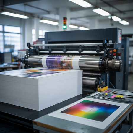
The colors you see on the screen (RGB) are not the same as the colors used in printing (CMYK). If the file is prepared in RGB, there can be significant differences – especially with intense, neon colors.
Tip: Always convert your design to CMYK before going to print. You will then avoid unpleasant surprises related to color reproduction.
3. Quality vs. file formats – PDF is the key
Word, JPG or PowerPoint files are not designed for professional printing. Even if they look correct, they may not maintain proportions, typefaces or layout. The safest format is PDF with bleeds and cut marks.
Checklist before going to press:
- Is the file in the right format (PDF)?
- Are the bleeds included (min. 3 mm)?
- Are the texts converted to curves?
- Are the colors in CMYK mode?
4. Print quality vs. design – when aesthetics meets technology
Good graphic design is not just a matter of taste – it is a concrete decision that directly affects the quality of printing. No matter how well prepared the file is technically, a bad layout can spoil the perception of the whole. What is worth checking?
- Contrast between background and text – too low = illegibility,
- font size – a minimum of 6 pt for text, below that it may spill over,
- lines below 0.2 pt often disappear with digital printing,
- lack of visual hierarchy results in a chaotic perception.
Example: The customer delivered a flyer with text in bright yellow on a white background. On the monitor – legible. In print – practically invisible. After correcting the colors and increasing the contrast, the effect was flawless.
5. Print quality vs. control – the last chance to improve things
Often the biggest enemy of quality is not bad files or equipment, but haste. Even a professional design can contain errors if no one checks it before printing. And yet this is the last moment to affect the quality of printing without additional costs.
What to do before printing:
- Make a digital proof or proof print,
- check the accuracy of the text, especially on covers and headlines,
- make sure margins and bleed are within specifications,
- compare the colors on the proof with the client’s expectations.
Example: a product brochure had a misplaced QR code – too close to the edge. In the proof it looked borderline. Thanks to the operator’s vigilance, the design was corrected and avoided a situation where the code would have been unreadable when trimmed.
Summary: print quality is the sum of the details
There is no single factor that determines the quality of a print. It’s the sum of many elements – from file format to colors to design decisions. Each of them can improve the result … or ruin it. That’s why if you care about quality, trust a proven printer who not only prints, but also advises.