


Vector graphics are a popular design solution, valued for their scalability and sharpness at any resolution. However, not every project should be created in vectors. When is it better to abandon this technology? We explain why sometimes vector graphics can bring more problems than benefits.
1. Vector graphics and its limitations – what is worth knowing?
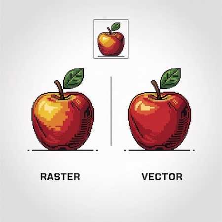
Vector graphics (created in programs such as Adobe Illustrator or CorelDRAW) are based on mathematical equations that describe shapes, lines and colors. As a result, it can be enlarged at will without loss of quality. However, this technology also has its drawbacks:
- It is not suitable for realistic images. Vectors are great for logos, icons or typography, but will not reproduce photo details, shadows or gradients as well as raster graphics (such as JPEG or PNG).
- Problems with textures and special effects. If a project requires natural textures (e.g., wood, fabric) or complex lighting effects, vector graphics can look unnatural.
- Complex designs = large file. While simple vectors are lightweight, complex illustrations with multiple paths can become difficult to edit and process.
Example from practice:
The client ordered business cards with a background imitating watercolor. The design in vector looked artificial, as vectors did not convey subtle color transitions. Only when converted to raster graphics was the desired effect achieved.
2. When is vector graphics not the best choice?
Photography and paintings full of details
If your project is based on photographs, vector graphics will not be a good solution. Attempting to vectorize photographs (for example, through the Image Trace function in Illustrator) often produces an unnatural “poster” effect with loss of fine detail. In such a case, it is better to stay with traditional raster formats, such as TIFF or PSD.
Projects requiring advanced effects
Gradients, blurs or shadows in vector graphics work, but editing them is sometimes cumbersome. If you’re working on a project with a lot of special effects (such as a cosmetics ad with soft highlights), raster may be more convenient.
Websites and animations
Although SVG (a vector format for the web) is popular, not all browsers and systems support it perfectly. For complex animations, hybrid solutions or PNG sprites will work better.
3. Is it always necessary to choose? Vector graphics and possible compromises
Not every project requires a radical choice between vectors and raster. Often the best solution is a combination of both techniques:
- Logo in vector + background in raster – for example, a business card with a vector logo, but with a photographic background.
- Vectors + textures applied separately – e.g., a vector illustration with a separate texture layer in Photoshop.
- Export to optimal format – sometimes it’s worth saving a vector design as a high-quality PNG/PDF to preserve details.
Summary
Vector graphics is a powerful tool, but not a universal one. If you are working on:
🔸 realistic photos,
🔸 designs with rich textures,
🔸 animations or complex effects,
better consider other formats.
Need help choosing the right format? Our specialists will be happy to advise you – contact us or check out our design services!