


Textured paper is increasingly appearing in premium projects. It is chosen by fashion brands as well as publishers, who want to emphasize the quality of the product already at the material level. But while it looks elegant and original, it doesn’t always behave as the customer – or the designer – expects. So before you place an order, read what you should know about textured paper in printing practice.
1. Textured paper affects text legibility
This is the first and most important thing: textured paper is not neutral. Its surface – depending on the type – can have fine striations, a grainy texture or pronounced embossing. While this looks striking, with small graphic elements it can cause readability problems.
This is especially true for thin fonts (less than 8 pt), delicate lines or illustrations with fine detail. On deeply embossed papers (e.g., linen, canvas), the ink does not always distribute evenly, resulting in ink “spilling” or collecting only on the tops of the embossing. The result? The letters can look blurry or “intermittent.”
2. Colors look different than on smooth coated paper
When printing on textured paper, you have to expect that the colors will not look the same as on classic coated paper. The surface of the paper absorbs ink more unevenly, which can affect the contrast, saturation and overall color impression. This is especially noticeable with full aplites and dark colors.
It’s a good idea to do a proof or test print even before approving the print run. This is especially important for projects where color plays a key role – such as product photography, image catalogs or limited edition packaging.
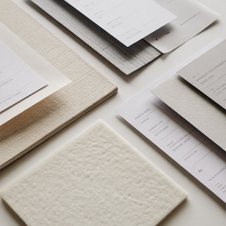
3. Textured paper doesn’t need much to make an impression
Unlike smooth papers, textured paper itself can sometimes be the main aesthetic element of a project. Often all it takes is a sparing print, clear typography or one well-chosen finish to create a material that stands out from the competition.
It works well for such projects as:
- Invitations and commemorative materials,
- minimalist business cards,
- book or notebook covers,
- certificates, diplomas, certificates.
In these applications, the structure of the paper “plays first fiddle” and the color of the printing only emphasizes it.
4. Not every textured paper is suitable for digital printing
Although digital printing allows for low print runs, not every textured paper will be suitable for it. Deeper embossing or unusual surface finishes may not work with toner or lead to uneven printing. In practice, this means, for example, poorer color coverage, a problem holding small features or a lack of full ink adhesion.
That’s why it’s always worth it:
- Ask the printer if the paper you want to use is suitable for digital printing,
- select an alternative paper with a similar texture but better compatibility,
- avoid the most demanding structures for print runs of less than 100 pieces.
5. Invoiced paper is worth testing – and price reckoning
The choice of structured paper is a decision that should go hand in hand with testing and consultation. Such paper is usually more expensive than standard chalk or offset, and its parameters – grammage, thickness, availability – can affect not only the visual effect, but also logistics (e.g., shipping weight).
If the design is to be striking and distinctive – by all means, it is worth investing in textured paper. But it is also worth thinking about whether it has to apply to the entire project, or, for example, only to the cover, dividers or title pages. Such compromises often give the best end result – visually and budget-wise.
Summary
Textured paper is a material with great potential, but also with many nuances. Before you decide to use it, make sure it fits the form of printing, the type of graphics and your expectations. And if you are not sure – ask the printer for samples, suggestions and examples of implementation. Sometimes just one detail is enough to turn an ordinary project into something really special.