

The world of printing has its own rules, and complicated printing terms can make it difficult to complete a project. Do you know the difference between CMYK and Pantone? Why are bleeds so important? Learn 10 key printing terms that will help you avoid mistakes and ensure a professional end result.
1. CMYK – the basic color space in printing
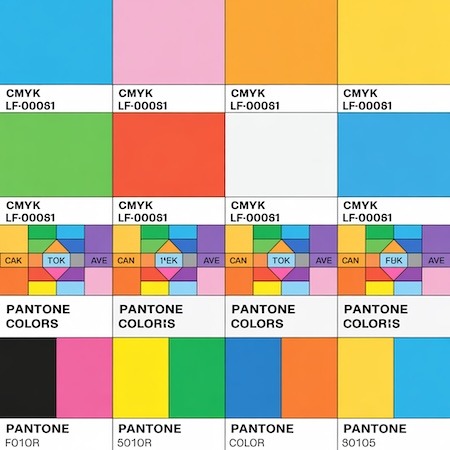
Printing terms often start with CMYK – an acronym for the four colors of ink: Cyan (C), Magenta (M), Yellow (Y) and Black (K – “Key”). Unlike RGB (used in monitors), CMYK has a narrower color gamut, so some bright colors may look different on print.
Why is this important?
- Designs for printing should be created in CMYK.
- RGB colors may lose intensity after conversion.
2. Pantone – a system of precise colors
Pantone (PMS – Pantone Matching System) is a template that ensures perfect color matching regardless of the printer. It is used when an exact shade is needed (for example, in company logos).
Example:
Coca-Cola is using a specific Pantone shade of red to make its branding consistent around the world.
3. DPI (Dots Per Inch) – density of dots per inch
DPI determines the resolution of printing. The standard is 300 DPI – lower values can cause blurring or pixellosis.
When to pay attention to DPI?
✔ For large-format projects (such as banners), you can use a lower DPI (150-200) because they are viewed from a distance.
✖ In printing business cards or flyers, always stick to 300 DPI.
4. Bleeds – margin of safety
A bleed is an extra area (usually 2-3 mm) beyond the target format that prevents white lines when trimmed. If the design has a background, it must “extend” into the bleed.
A mistake that costs money:
The client did not add bleeds to the business card design. After trimming, white edges appeared – the entire print run was suitable for discarding.
5. Paper weight – thickness in practice
The grammage (given in g/m²) determines the weight and stiffness of the paper:
- 80-100 g/m² – thin paper (e.g. for flyers)
- 250-350 g/m² – business cards, invitations
- Above 350 g/m² – cardboard (e.g., packaging)
6. Proofing – color sample
Proof is a test print that shows what the final colors will look like. It is worth ordering, especially for large print runs.
Types of proofs:
- Digital – fast and cheap, but less accurate.
- Printing – simulates the end result (e.g. Matchprint).
7. Laminating – print protection
Laminating (glossy/matte) protects the print from abrasion and moisture. Popular in:
- Business cards
- Restaurant menu
- Catalog covers
8. Creasing – preparation for folding
Creasing is a cut in the paper that makes it easier to bend without cracking. It is used, for example, in:
- Invitations
- Cardboard packaging
- Brochures
9. Folding – the method of folding
Folding is the term for various methods of bending sheets, such as:
- Parallel waveguide – a leaflet folded “on an accordion”.
- Cross fold – for example, in tourist maps.
10. RIP (Raster Image Processor) – printer software.
A RIP is a program that converts a graphics file into instructions for a printing machine. Its quality depends on, among other things.:
- Color fidelity
- Sharpness of details
- Printing speed
Summary
Knowing printing terms makes it easier to communicate with the printer and helps avoid costly mistakes. Remember especially:
✔ CMYK and Pantone – choosing the right color space.
✔ Bleed and DPI – crucial to print quality.
✔ Proofing – the last moment for corrections.