


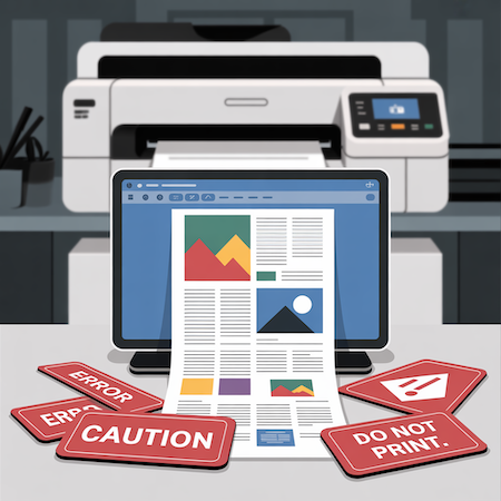

Printing from Word is a subject full of pitfalls. On the surface, everything seems simple: you have a Word file, upload the content, add a photo and send it to print. In practice? The problems start right away. Over and over again, there are myths that can cost you not only nerves, but also additional revisions, time and money. We’ve collected five of the most common – and suggest how to avoid them.
1. Printing from Word gives quality comparable to PDF
This myth still circulates even among experienced users. Unfortunately – Word does not provide full control over the appearance of the file. It happens that when you open a document on another computer, fonts change, elements move, and colors lose their intensity.
Why? Word uses system resources. If a font is missing or a graphic has been pasted in low resolution, the program will not report it. The printer finds out about the errors… only at the production stage.
Solution: always export files to PDF/X format, which embeds fonts and preserves layout. If you do not have this option – consult the file with the printer.
2. Setting A4 format is all you need to do for printing from Word
That’s right – Word allows you to choose the page format. But that’s just the beginning. Printing from Word often ignores technical printing requirements, such as bleeds (that is, safety margins extending beyond the cut area) and inner margins.
The result? When printed, elements disappear from the edges of the page, and graphics are cropped not where they need to be.
How to avoid mistakes?
- Leave a minimum of 3-5 mm safety margin inside the page
- Don’t place text too close to the edges
- If the design has a background that is supposed to “come out” of the format – report it to the printer
3. The colors on the screen will look the same in print
This is an extremely misleading myth. A computer screen works in RGB space – bright, saturated and dynamic. Printing works in CMYK – a more subdued space, physically limited by pigment.
Printing from Word does not allow conversion to CMYK, and this means a high risk of color falsification. A logo in intense blue can come out grayish-blue. A background photo – gain a yellowish filter.
In a professional project such changes are unacceptable. That’s why it’s a good idea to treat Word documents as working, not final.
4. Word is suitable for any type of project
This belief persists, especially for projects with limited budgets. Yes – Word may be enough for a simple flyer, but for complex brochures, catalogs or banners, it’s simply not enough.
It lacks typesetting tools, grid support, paragraph styles, page numbering, precise positioning. Not to mention bleeds or working on layers.
Sometimes a customer delivers a Word file hoping that “the printer will do something with it.” And yes – they will. But this is already a DTP service, priced separately.
💡 Conclusion: if you are planning something more than a form letter, consider outsourcing the typesetting to a professional graphic designer.
5. The printer will correct everything for me
This is a temptation that is better avoided. Of course, many printers – including us – offer to check the file. But printing from Word carries the risk of having to completely rebuild the file.
The problem is that no one corrects such things “automatically.” Every change is time: adding bleeds, correcting colors, swapping fonts or improving layout. It’s an additional service, the cost of which can exceed the value of printing.
👉 The most common corrections we make to Word files:
- Adding gradients
- Replacing fonts not available in the system
- Correction of backgrounds that do not reach the edges
- Conversion of graphics from low resolution
That’s why it’s always better to ask the printer beforehand than to send a file “at random.”
Summary: printing from Word – it can be done, but mindfully
Is printing from Word possible? Yes. Is it seamless? Not necessarily. It’s an office tool, not a graphics tool. If you know what to avoid – you are one step ahead of most users.
Have a Word file and don’t know if it’s suitable for printing? Send it to us – we will check it free of charge, suggest what to correct, or prepare a print-ready version.
📩 Contact us – we will advise you on the best solution.