


The slogan “print-ready design” sounds reassuring. File saved in PDF, graphics in place, text inserted, colors set. The problem is that in practice, very often a print-ready design turns out to be an “almost ready” design. And the difference between “almost” and “really” can cost time, nerves and money. Here are 6 warning signs that show that the project still needs to be revised.
Design finished, but without bleeds and safe margins
Lack of safe margins is the second warning sign. Text placed too close to the edge can be visually “cut off” or look unsightly, even if it physically fits. A professional print-ready design always considers technical cutting tolerances.
Print-ready design with colors in RGB
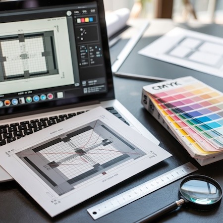
This is a classic. File looks great on the monitor because it was prepared in RGB. The problem is that the printer works in CMYK. The differences in saturation and brightness can be significant, especially with intense blues, greens or neon shades.
If the print-ready design contains elements in RGB, the conversion to CMYK will happen automatically – but the result may not be as expected. A professional check before shipping can avoid disappointment.
6 signals that the project needs correction
- Lack of bleeds or incorrect page format.
- Text saved as fonts rather than converted to curves.
- Graphics with too low a resolution (less than 300 dpi).
- Inappropriate number of pages in a stapled or glued publication.
- Failure to include the spine in the cover design.
- Black background constructed from a single color instead of the so-called deep black.
Any of these points can make a project need tweaking, even if it looks correct visually.
Print-ready design not including binding
The design of a book, catalog or notebook does not end with the spreads. The type of binding affects the layout of the content. In a glued binding, some of the content “hides” in the spine, in a notebook there is the phenomenon of shifting of pages (creep), and in a hardcover you have to take into account wraps and liners.
If the print-ready design does not take these elements into account, you may find that important pieces of content will be too close to the center or edges.
What to check before sending your file to the printer
Before you upload the file and consider the project actually ready, it’s a good idea to go through a short checklist:
- Does the file have the correct end format + bleed?
- Are all colors in CMYK or Pantone?
- Do the graphics have min. 300 dpi?
- Has the back of the cover been calculated correctly?
- Does the design take into account the binding method?
It’s a few minutes of work that can save days of corrections.
Why it’s a good idea to consult a print-ready design with a printer
Even experienced graphic designers sometimes do not have full knowledge of a printer’s specific production parameters. Machines vary in tolerances, papers vary in thickness, and binding methods affect the final result.
That’s why it’s best to treat a project as a stage, not a final state. A brief consultation with the printer allows you to catch details that are not visible on the screen.
Summary
A print-ready design is not only about aesthetics, but, above all, technical correctness. If even one of the signals described appears in your file, it’s worth stopping for a moment and checking the details. Printing is a precise process – and minor shortcomings at the design stage can grow into big problems in production.