


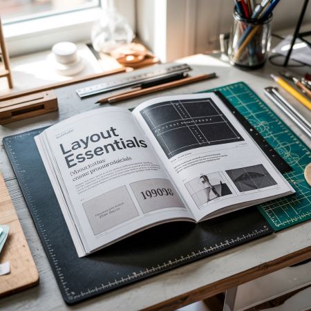

Margin settings are one of the key elements in designing for print. Although often overlooked or downplayed, they have a huge impact on the final output. Correctly set margins protect the content of the document, increase its readability and facilitate the entire production process.
In practice, margins determine whether the material will look professional or casual. Their importance increases with multi-page projects, such as brochures, catalogs or books. There, margins also affect reading comfort.
What exactly are margins?
Margins are the area between the edge of the page and the content of the document. They do not contain any key elements – it is a “safe zone” that prevents problems when cutting or folding. Thanks to them, nothing important gets cut off and the page layout looks harmonious.
Margin settings are also important because they improve the aesthetics of the design. Margins that are too narrow make everything look compressed. Too wide – they can cause an impression of emptiness. A well-chosen margin supports the composition and guides the viewer’s eye.
The most common mistakes with margin settings
Even experienced graphic designers make mistakes related to margins. Here are the ones that occur most often:
1. Margin too small: Content or graphics are too close to the edge of the page. The result? Clipped text or too tight a composition.
2. No interior margin: In folding projects, such as catalogs or books, the inside of the spread requires extra space.
3. Uneven margins: Margins set “by eye” often result in visual chaos and an unprofessional design appearance.
4. No distinction between margins and bleeds: The bleeds are the space outside the cut format, the margins are inside. Both are necessary.
5. No technological margin: This is a special content-free zone – important for automatic cutting and folding.
Margin settings – how to do it right?
There is no one universal value for all projects. For simple materials – such as flyers, business cards or posters – it is accepted to use a minimum of 5 mm margin on each side. If the project contains a lot of text, the margin can be 10-15 mm.
In multi-page publications (such as brochures, catalogs), the inner margin should be wider than the outer margin. The reason? During binding or sewing, some of the content may “disappear” into the spine. It is worth taking this into account already at the design stage.
In graphics programs (Adobe InDesign, Illustrator, Affinity Publisher), margins are set when creating the document or in the page options. A good practice is to use grids, auxiliary lines and ready-made templates. This will keep the design consistent and secure.
An important rule: don’t place anything important – logos, icons, headings – closer than 5 mm from the edge of the format. This is a safety limit that is always worth keeping.
Margin settings vs. bleeds – differences you need to know
The terms margin and bleed are often confused, although they serve completely different functions.
The bleed is the area extending beyond the cut format. It allows the background or graphics to reach the very edge of the page after trimming.
The margin, on the other hand, is the area inside the page where important elements are not placed.
Lack of margin can lead to text being cut off. Lack of bleed – to a white line near the edge. Both errors are the cause of the most common printing complaints.
Printers – including druck.pl – recommend: a minimum 3 mm bleed and a minimum 5 mm margin. For folded publications it is worth using larger margins, according to the binding technology.
What does the printer recommend?
For multi-page projects, the margins can be as much as 15 mm – especially on the spine side. For one-off projects – such as invitations, cards, certificates – a 5 mm margin is enough. It is also worth leaving the so-called technological margin, that is, additional “slack” for accurate cutting.
If you have doubts, contact us – we will always advise you on the optimal solution.
Summary: margin settings matter
Margin settings are not a formality. They are the basis of a good design that looks good and goes to print without problems. Their proper use protects the content of the document, facilitates production and eliminates the risk of errors. Ignoring margins can cost you more than a few extra millimeters.
If you want to make sure your materials look professional – start with margins. It’s a simple step that makes a huge difference.