
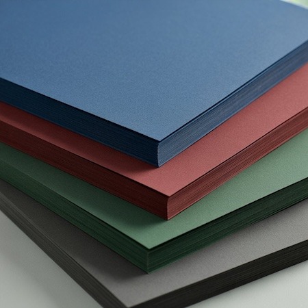

Dye-printed paper is a solution that is increasingly appearing in premium designs, corporate identities and art publications. Its characteristic feature is that the color is not just on the surface, but permeates the entire cross-section of the sheet. As a result, edges, creases and cutting areas maintain a uniform color, without a white “core.” Not every project needs gloss, UV varnish or gold foil. Sometimes the greatest effect comes from the material itself.
It is the detail that can dramatically change the perception of the project.
Visual and structural effect
The biggest difference is seen where the material is exposed at the edges. In classic coated paper, after cutting, the white center is visible, even if the surface is heavily printed. In the case of dye-sublimated paper, the color is uniform throughout the structure, so when die-cutting, creasing or cutting, the effect is much more consistent.
This is especially important with:
- Business cards with thick cardboard,
- invitations and menu cards,
- cut packaging,
- covers with an exposed spine,
- corporate identity elements with a raw finish.
Dye-printed paper often does not require additional printing with a full aplomb of color. The material itself builds the character of the design, and the printing serves an informative, not decorative, function.
Dye-printed paper in premium designs
In the premium segment, consistency of detail is of great importance. If the brand communicates with the color of deep navy blue, maroon or bottle green, classic printing on white cardboard does not always give the desired effect. Dye-printed paper allows you to transfer your visual identity directly to the material.
In addition, many mass-dyed papers have a slightly raw, natural texture, which works well with minimalist design. A design doesn’t have to be “overloaded” to look quality. All you need is a well-chosen material and subtle embossing, hot stamping or white printing.
Importantly, this paper responds very well to techniques such as:
- embossing without foil (so-called blind embossing),
- hot stamping in gold, silver or copper,
- white screen printing,
- selective varnish (to a limited extent).
This allows you to build contrast not with color, but with texture and light.
When dye-printed paper is not the best choice
Although dye-sublimation paper gives a unique effect, it will not always be the optimal solution. First of all, it should be remembered that the cost of such material is higher than standard offset or chalk. For large print runs, the difference in budget can be significant.
The second issue is color reproduction. Printing on dark paper often requires white primer or special technologies, which can increase the cost and lengthen the production process. Not every project – especially a multicolored catalog – will look good on dye-sublimated paper.
It’s worth considering another solution if:
- The project includes a lot of full-color photography,
- budget is severely limited,
- we depend on a very accurate representation of CMYK colors,
- the material will be bent intensively in thin weights.
Tinted paper vs. impression of durability
One underrated advantage is visual resistance. Even if the edge rubs off slightly, the contrasting white core is not visible. This makes products made of dyed paper retain their aesthetic appearance longer.
In projects such as luxury packaging or premium business cards, this detail matters. The material does not “betray” its construction. The whole looks solid and thoughtful.
Summary
Dye-printed paper is a solution for projects where the material has to be part of the message. It is not a paper for everything, but where detail, color consistency and premium effect matter – it can make a huge difference.
If you want a subtle, elegant effect without excess refinement, it’s worth considering dyed paper already at the project concept stage. Sometimes it is the material, not the print, that builds the strongest impression.