


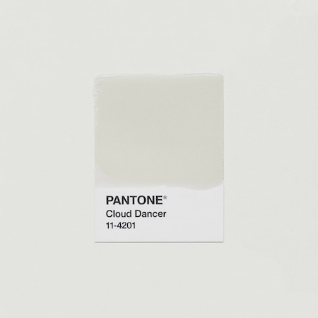

Cloud Dancer is the Color of the Year 2026 according to the Pantone Institute. And while surprising to many – because it’s a shade close to pure white – it has great potential in design and print. In this article, we show how the 2026 color of the year can be used creatively in advertising materials, catalogs, packaging and brand identity.
1. Cloud Dancer as the foundation of a modern layout
In a world dominated by saturated colors, glitter and gradients, Cloud Dancer introduces… silence.
It’s a space that allows what’s really important – content, typography, photography – to resound. In B2B materials, reports, presentations, but also lookbooks or catalogs of the beauty industry, this “almost white” color creates an atmosphere of elegance, purity and professionalism.
It works well on:
- Uncoated papers with high whiteness (e.g., Munken Kristall, Pergraphica High White)
- textured papers (e.g. Gmund Original, Design Offset)
- in combination with metallic accents – gold, copper, silver
2. Cloud Dancer in premium packaging
Minimalist packaging with dominant white always looks “expensive.”
As a slightly off-white, milky white with a hint of organic softness, it is perfect for premium projects – candles, cosmetics, gift books, calendars, tea boxes.
Worth adding:
Such a set attracts the eye and encourages touch – and this works on the emotions of customers.
3. Cloud Dancer and brand identity
If your brand is planning a rebranding or introducing a new product – consider the color of the year 2026 as the base color.
Unlike regular white, this shade is more “soft” and less technical. It blends well with earth colors (beiges, sandy, olive), pastels, but also with black and strong navy blue.
Applications:
- letterhead, envelopes, business cards
- advertising folders and offer folders
- landing pages and digital campaigns (here, too, it is worth taking care of consistency with print)
4. Color 2026 as a background for photography
Cloud Dancer is neutral, but not “cold”. That’s why it works well as a background for product photography – in lookbooks, catalogs, advertising brochures. Prints on such a background better reproduce colors, and at the same time boost contrast.
This is especially important with:
- fashion and textiles
- culinary projects (cookbooks, food packaging)
- children’s photography and wellness
5. Cloud Dancer in art print and limited edition projects
This color also has great potential in low-volume and fine art printing. Combined with hand gluing, limited numbering, stamps, embossing or a custom format – Cloud Dancer can be the base for a design that will be remembered.
Examples:
- artist’s portfolio
- photo albums
- collector’s editions of books or vinyl records
Summary
Inconspicuous, yet extremely versatile.
Cloud Dancer is an excellent choice for brands that want to emphasize quality, calmness, maturity and subtle elegance. It is a color that, although “invisible”, builds an atmosphere of trust.
If you are considering its use in your project – write to us. We will advise on paper, finishing and prepare a proof.